

How to Choose Nail Color for Your Skin Tone (Shade Guide)

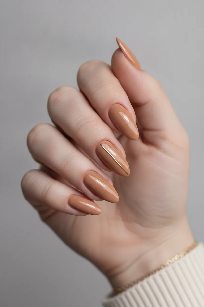
In short: Find your undertone first, then pick shades that match it. Cool undertones (blue veins, silver jewelry) suit true blue red, mauve, lilac and navy. Warm undertones (green veins, gold jewelry) suit peach, coral, terracotta, olive and caramel nudes. Neutral skin can wear both, so choose by contrast, and always pick a nude one or two shades deeper than the back of your hand.
How Do You Pick Nail Color for Your Skin Tone?
Check your undertone in daylight, then match the shade family to it. Blue or purple veins and crisp-looking silver jewelry mean cool skin, so blue-based reds, mauve, lilac and navy work best. Green veins and richer-looking gold mean warm skin, so peach, coral, terracotta and caramel nudes win. If both metals look fine you're neutral, so pick by contrast instead: soft muted shades for low contrast, deep or bright ones for high contrast.
The fastest way to pick a flattering nail color is to find your undertone first. Cool undertones look best in blue-based shades like true red, mauve and lilac. Warm undertones glow in peach, coral, terracotta and caramel nudes. Once you know which side you’re on, shade shopping stops being a guessing game.The 30-Second Undertone Test
Do this in daylight, near a window. Bathroom bulbs lie about color. Salon lighting does too, which is why so many people get home and hate the shade they picked.1. Look at your veins
Turn your wrist over. Blue or purple veins mean cool undertones. Green or olive veins mean warm. If you see a mix and can’t decide, you’re likely neutral.2. Hold up jewelry
Put a silver ring next to a gold one on the same hand. Silver looks crisp and clean on cool skin. Gold looks richer on warm skin. If both look fine, you’re neutral and you have the easiest job here.3. The white paper test
Hold a sheet of plain white paper under your chin or against the back of your hand. Cool skin looks slightly pink or rosy next to it. Warm skin looks yellow, golden or peachy. Neutral skin looks beige.4. Check how you tan
Burn fast and turn pink? Usually cool. Tan easily to a golden brown? Usually warm. This one isn’t perfect, but it’s a good tiebreaker when the first three tests disagree. One more thing that matters as much as undertone: contrast. Compare your skin to your nail color. Low contrast (a shade close to your skin) always looks soft and expensive. High contrast (much darker or brighter than your skin) makes a statement and makes hands look shorter, so keep the nail a bit longer.Best Nail Colors for Fair Skin
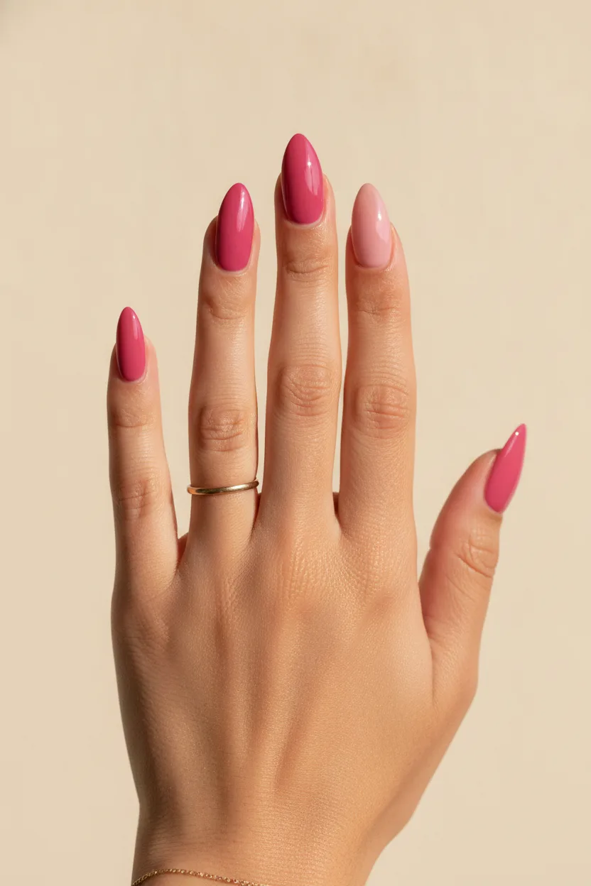
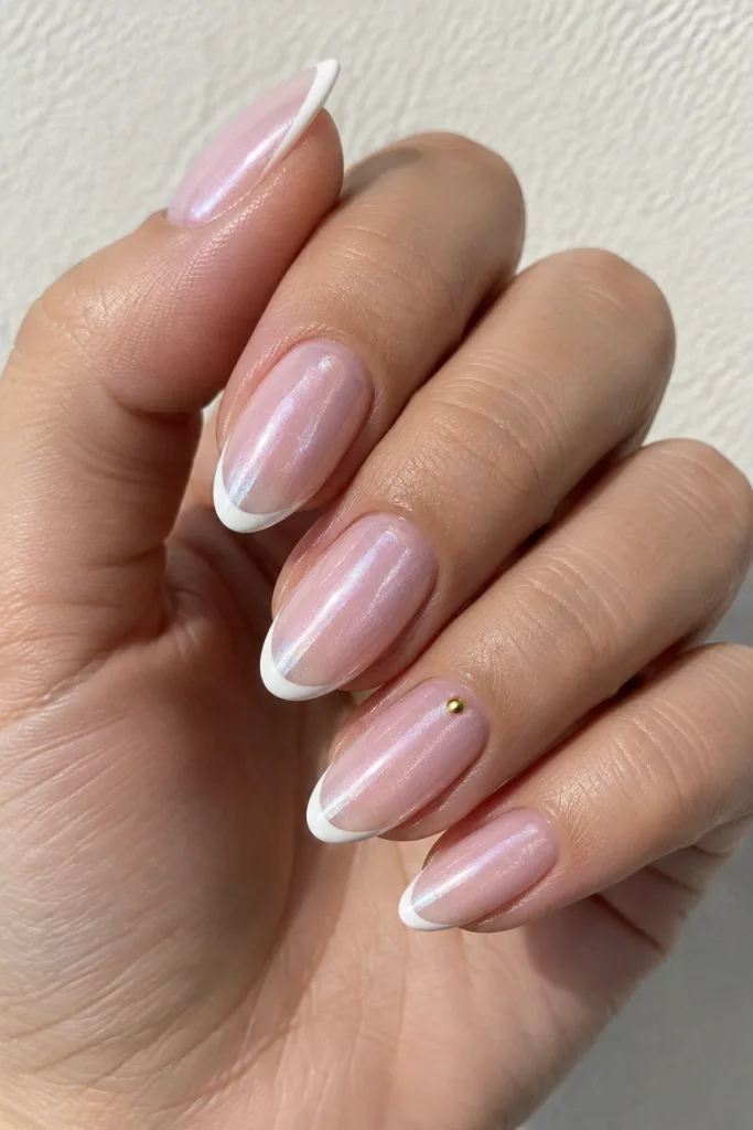
- Sheer ballet pink. One or two coats, glossy top coat. Clean and never harsh.
- Cool mauve. The safest “grown-up nude” for pink-toned fair skin.
- True blue red. Think classic cherry red, not orange red. It makes fair hands look brighter.
- Deep burgundy. High contrast and very flattering in fall and winter.
- Soft lilac. Pretty on cool fair skin, especially on short almond nails.
- Navy. A quieter alternative to black that doesn’t look heavy.
- Milky white. Works on fair skin if it leans slightly pink or peach, not chalky.
Best Nail Colors for Light to Medium Skin
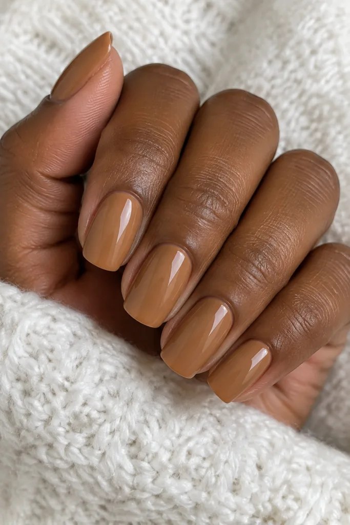
This is the most flexible group, but the wrong nude still disappears. Go one or two shades deeper than your hand.- Caramel nude. Warm, creamy, and it lengthens the finger line.
- Dusty rose. The everyday shade you’ll rebuy forever.
- Brick red. More wearable than bright red for daily life.
- Sage green. Muted and modern, great with gold rings.
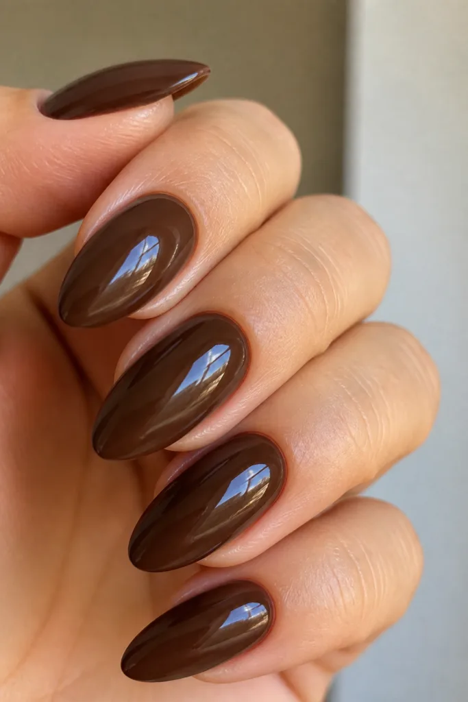
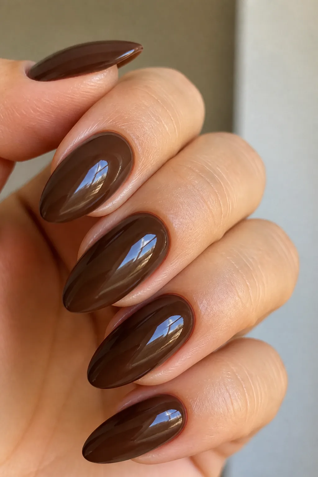
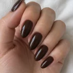
- Chocolate brown. Still going strong and it flatters almost every medium tone.
- Baby blue. Fresh in spring, especially with a glossy finish.
- Pearl chrome. The soft shimmer picks up your natural warmth.
Best Nail Colors for Olive Skin
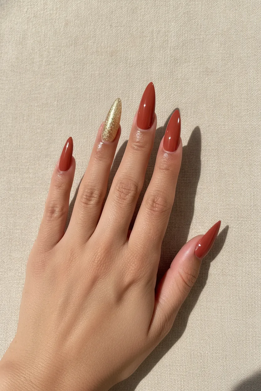
- Terracotta. Almost made for olive hands. Try it in a creme finish.
- Warm coral. Bright but not loud, great in summer.
- Mustard or ochre yellow. Unexpected and it really works here.
- Emerald green. Deep and glossy, gorgeous on longer nails.
- Bronze shimmer. Reads like jewelry on olive skin.
- Warm espresso brown. A safe dark shade that isn’t black.
- Golden nude. Pick one with a yellow base, never a pink one.
Best Nail Colors for Tan and Golden Skin
Tan skin makes almost everything look better, so use it. Bright and creamy shades pop hardest here.- Milky white. The classic tan-skin flex. Instant contrast, no effort.
- Hot coral. Reads like vacation nails.
- Butter yellow. Soft, warm and very current.
- Turquoise. Bright blue-green looks amazing against golden skin.
- Cocoa nude. A tan-friendly nude that actually shows up.
- Orange red. Warmer red beats blue red on golden skin.
- Chrome silver. Cool metal against warm skin is a great clash.
Best Nail Colors for Deep Skin
- Mocha and toffee nudes. Match your skin depth, then add gloss.
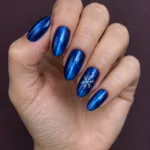
- Cobalt blue. Bright, clean and striking.
- Fuchsia pink. One of the most flattering brights, hands down.
- Tangerine. Summer nails that look expensive.
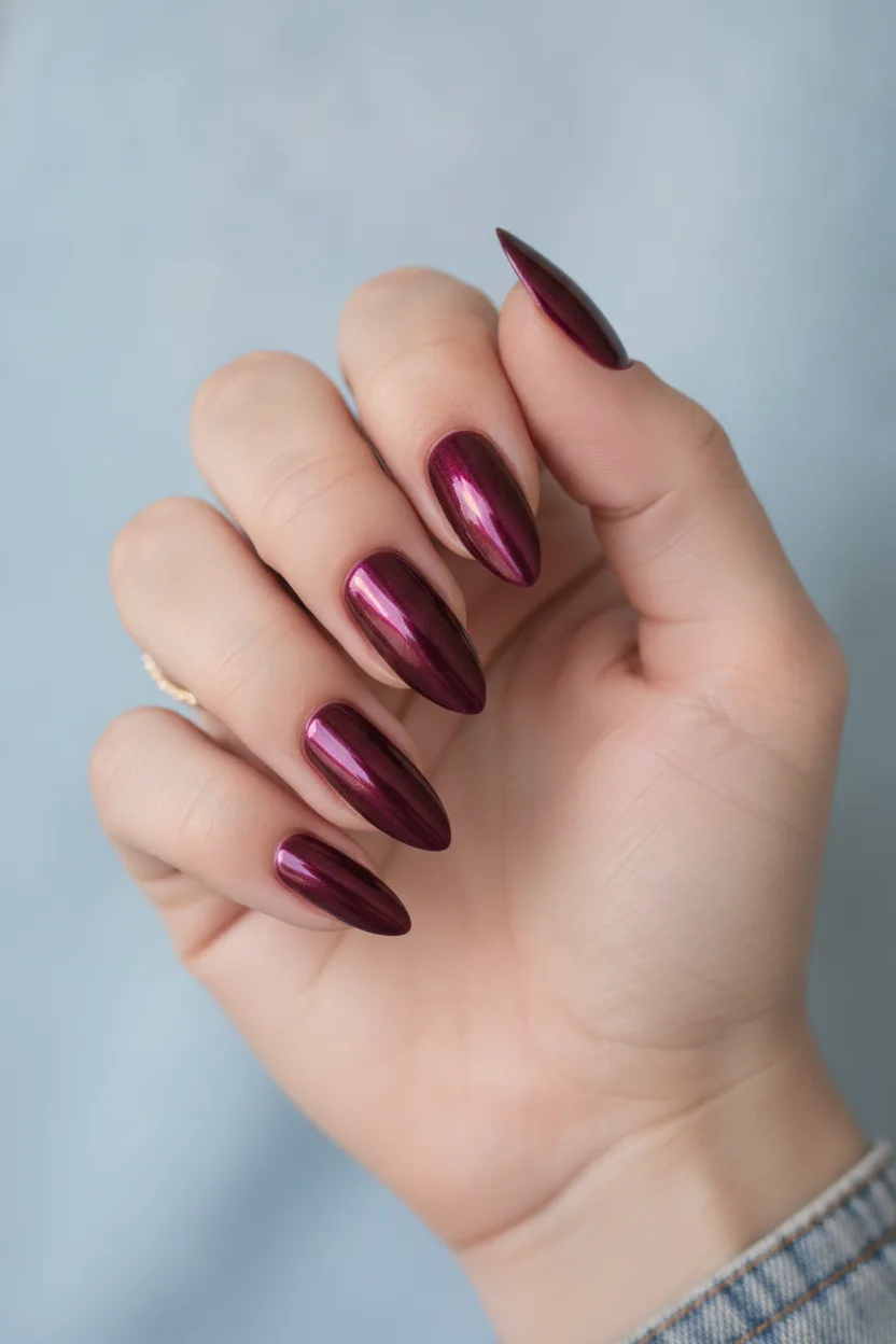
- Wine and plum. Deep, glossy, works year round.
- Crisp white. Maximum contrast, best on short square or almond nails.
- Gold chrome. Warm metallics glow instead of looking dusty.
Colors That Work on Almost Everyone
If you’re still unsure, these five are close to universal because they carry both warm and cool notes:- Sheer milky pink for a clean, groomed look.
- Deep wine red for evenings and cold months.
- Chocolate brown for a neutral with actual personality.
- Dusty mauve for work weeks.
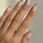
- Classic french tips when you want zero risk.
How to Test a Shade Before You Commit
Gel sets cost 40 to 80 dollars and stay on for three weeks. That’s a long time with a color you don’t like.- Hold the bottle against the back of your hand, not your palm. Palms are pinker and they lie.
- Ask the tech to paint one swatch on a tip and hold it against your fingers in natural light.
- Check it next to your everyday jewelry. If your gold rings suddenly look cheap, the shade is too cool for you.
- Take a photo with your phone flash off. Colors that clash always show up in photos first.
- Not sure a color suits you? Preview it on your own hands first with Nartie, then book.
What to Ask Your Nail Tech
Techs see hundreds of hands, so use that. Try these exact lines:- “Do I look warm or cool to you?”
- “Can you show me your two best-selling nudes for my skin tone?”
- “Is this shade going to need three coats to look even?” Thin, patchy formulas look worse on every skin tone.
- “Would this look better sheer or opaque on me?”
Get this look at homeShop the look
Try it on See it on your own hand Take a photo of your hand and Nartie puts any design from this page on your own nails, so you can choose before you book.

 NartieTry it on your hand
- Cool mauve nail polishSee on Amazon ›
- Caramel nude polishSee on Amazon ›
- Blue based red polishSee on Amazon ›
- Glossy top coatSee on Amazon ›
- Gold chrome nail powderSee on Amazon ›
As an Amazon Associate I earn from qualifying purchases. These links open Amazon search results, so you can pick the shade and brand you like.
Some photos in this post are AI-created concept images, made to show colors, shapes and nail art together. How we create our images
Related Nail Ideas
- nude nail ideas for every skin tone
- milky white nails on tanned hands
- warm terracotta nail ideas
- deep burgundy nail tips
- chrome nails in gold and silver
Not sure if a mauve or a caramel nude suits your hands? Preview both on your own nails in Nartie before you book.
FAQ
How do I know if I have warm or cool undertones?
Look at your veins in daylight, near a window. Blue or purple veins point to cool undertones, green or olive veins point to warm. Then hold a silver ring next to a gold one on the same hand and see which metal makes your skin look brighter. If you see a mix and both metals look good, you're likely neutral.
What nail color makes hands look less red?
Neutral and slightly warm shades calm redness best. Caramel nude, soft peach and warm brown all work. Skip bright pink, fuchsia and cool berry tones, since they pull more red out of the skin.
Which nude nail shade should I pick for my skin tone?
Pick a nude one or two shades deeper than the back of your hand, never an exact match. Fair skin looks best in pink or mauve nudes. Medium and olive skin suit caramel and golden nudes with a yellow base. Tan and deep skin look best in cocoa, mocha and toffee tones.
What red should I wear on my nails?
The base of the red matters more than the brightness. Cool skin takes red with a blue or berry base, like a classic cherry. Warm and golden skin takes red with an orange or brick base. Both look great, they're just different reds.
How do I test a nail color before a gel set?
Hold the bottle against the back of your hand, not your palm, since palms are pinker and they lie. Ask the tech to paint one swatch on a tip and check it in natural light next to your everyday jewelry. Take a photo with the flash off too, because clashing colors show up in photos first.

Pingback: 18 Leopard Print Nails for Autumn: Caramel & Black
Pingback: 25 Valentine's Day Nails for Short Nails
Pingback: 24 Nude Nails for Deep Skin Tones That Flatter
Pingback: 14 Fall Nail Colors 2026: Espresso, Olive, Cranberry
Pingback: How to Pick a Nail Shape for Your Hands (Easy Guide)